¶ Covid Data Analysis using RStudio
¶ Goal
The purpose of this notebook is to show the analysis of Covid data using data from individual states in the US.
- Author: John Pratt
- Updated: 8/3/2020
- Data can be found here:
https://covidtracking.com/data
¶ Methodology
The CDC has released the IFR (Infection fatality rate) for Covid. Their determination is 0.26%. (Reference: https://reason.com/2020/06/28/cdc-antibody-studies-confirm-huge-gap-between-covid-19-infections-and-known-cases).
Using this information we can calculate the number of people who have actually had Covid because we know the number of deaths.
(number of individuals who have had covid) = total deaths / .0026.
We can then calculate the percentage immune by dividing the (number of individuals who have had it) / (total population).
¶ Preparing the data
First we need to prepare the data and read it in from a CSV as a dataframe in R.
rawData           <- read.csv("daily.csv", stringsAsFactors = FALSE)
rawData$date      <- as.character(rawData$date)
rawData$FixedDate <- as.Date(rawData$date, format = "%Y%m%d") #Fix the date field
We also need to read in the data for the US
dataUS           <- read.csv("daily-us.csv", stringsAsFactors = FALSE)
dataUS$date      <- as.character(dataUS$date)
dataUS$FixedDate <- as.Date(dataUS$date, format = "%Y%m%d") # Fix the date field
Now we build a dataframe for just the states we are interested in.
dataVirginia             <- subset(rawData, rawData$'state' == "VA")
dataVirginia$numberHadit <- dataVirginia$death / 0.0026
dataVirginia$percentImmunity    <- (dataVirginia$numberHadit / 8536000) * 100
dataFlorida              <- subset(rawData, rawData$'state' == "FL")
dataFlorida$numberHadit  <- dataFlorida$death / 0.0026
dataFlorida$percentImmunity    <- (dataFlorida$numberHadit / 21480000) * 100
dataNewYork              <- subset(rawData, rawData$'state' == "NY")
dataNewYork$numberHadit  <- dataNewYork$death / 0.0026
dataNewYork$percentImmunity    <- (dataNewYork$numberHadit / 19450000) * 100
dataCali                 <- subset(rawData, rawData$'state' == "CA")
dataCali$numberHadit     <- dataCali$death / 0.0026
dataCali$percentImmunity <- (dataCali$numberHadit / 39000000) * 100
dataWashington           <- subset(rawData, rawData$'state' == "WA")
dataNewJersey            <- subset(rawData, rawData$'state' == "NJ")
dataConnecticut          <- subset(rawData, rawData$'state' == "CO")
dataMass                 <- subset(rawData, rawData$'state' == "MA")
dataTexas                <- subset(rawData, rawData$'state' == "TX")
dataArizona              <- subset(rawData, rawData$'state' == "AZ")
¶ Calculating the Totals for the State
In order to get an idea of overall statistics for the state we will total the numbers in the raw data set.
VAtotalCases            = head(dataVirginia$positive,1)
VAtotalHospitalizations = head(dataVirginia$hospitalizedCumulative,1)
VAtotalDeaths           = head(dataVirginia$death,1)
FLtotalCases            = head(dataFlorida$positive,1)
FLtotalHospitalizations = head(dataFlorida$hospitalizedCumulative,1)
FLtotalDeaths           = head(dataFlorida$death,1)
NYtotalCases            = head(dataNewYork$positive,1)
NYtotalHospitalizations = head(dataNewYork$hospitalizedCumulative,1)
NYtotalDeaths           = head(dataNewYork$death,1)
¶ Virginia
- Cases: 91782
- Hospitalizations: 13280
- Deaths: 2218
¶ Florida
- Cases: 487132
- Hospitalizations: 27524
- Deaths: 7206
¶ New York
- Cases: 416298
- Hospitalizations: 89995
- Deaths: 25170
¶ Calculate heard immunity rate of a subset of states
The CDC has released the infection fatility rate (IFR) as 0.26%. Using the total number of deaths in specific states, we can calculate the total number of people who have had COVID in this region.
VAnumberHadit = VAtotalDeaths / .0026
FLnumberHadit  = FLtotalDeaths / .0026
NYnumberHadit  = NYtotalDeaths / .0026
Individuals who have had Covid:
- Virginia: 853076.9
- Florida: 2771538
- New York: 9680769
Using the number of individuals who have had COVID divided by the total population of the states, we can calculate the heard immunity threshold of the region.
Total Population in 2020:
- VA: 8,536,000
- FL: 21,480,000
- NY: 19,450,000
Percentage of individuals who have had Covid:
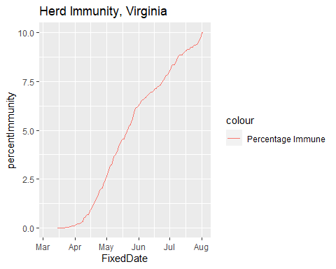
- Virginia: 9.99%
- Florida: 12.90%
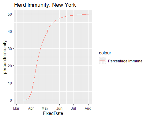
- New York: 49.77%
It looks like we are a couple of percentage points below the threshold needed for herd immunity.
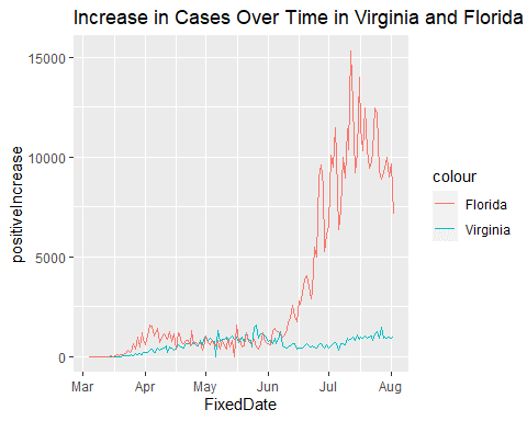
¶ Total Cases Over Time
Some additional data gleaned from the data set:
totalCases_vs_Deaths_Plot = ggplot() +
            geom_line(data = dataVirginia,
            aes(x = FixedDate, y = positiveIncrease, color='Virginia')) +
            geom_line(data = dataFlorida,
            aes(x = FixedDate, y = positiveIncrease, color='Florida'))
print(totalCases_vs_Deaths_Plot +
        ggtitle("Increase in Cases Over Time in Virginia and Florida"))
totalCases_Eastern_Plot <- ggplot() +
            geom_line(data = dataVirginia,
            aes(x = FixedDate, y = positiveIncrease, color='Cases')) +
            geom_line(data = dataVirginia,
            aes(x = FixedDate, y = deathIncrease, color = 'Deaths'))
print(totalCases_Eastern_Plot +
        ggtitle("Daily Cases vs. Daily Deaths, Virginia"))
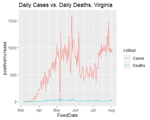
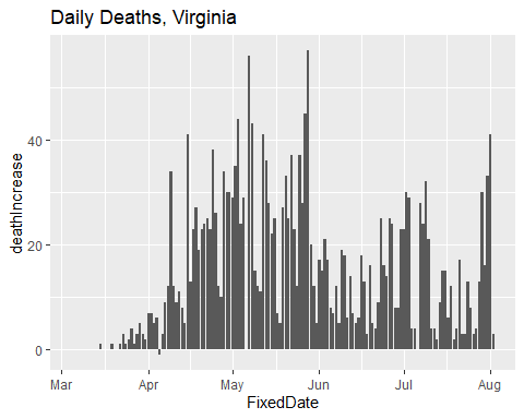
We can also separate out the graph of deaths related to COVID to more closely examine the trend. Although the number of cases is rising, the number of deaths is not.
totalDeaths_Eastern_Plot =
  ggplot(data = dataVirginia, aes(x = FixedDate, y=deathIncrease)) +
  geom_bar(stat="identity")
print(totalDeaths_Eastern_Plot +
        ggtitle("Daily Deaths, Virginia"))
Some additional plots for comparison
totalCases_Central_Plot = ggplot() +
geom_line(data = dataVirginia,
aes(x = FixedDate, y = positive, color = "Cases")) +
geom_line(data = dataVirginia,
aes(x = FixedDate, y = hospitalizedCumulative, color = "Hospitalized")) +
geom_line(data = dataVirginia,
aes(x = FixedDate, y = recovered, color = "Recovered")) +
geom_line(data = dataVirginia,
aes(x = FixedDate, y = death, color = "Deaths"))
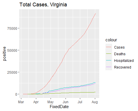
print(totalCases_Central_Plot +
ggtitle("Total Cases, Virginia"))
totalCases_Central_Plot = ggplot() +
geom_line(data = dataFlorida,
aes(x = FixedDate, y = positive, color = "Cases")) +
geom_line(data = dataFlorida,
aes(x = FixedDate, y = hospitalizedCumulative, color = "Hospitalized")) +
geom_line(data = dataFlorida,
aes(x = FixedDate, y = recovered, color = "Recovered")) +
geom_line(data = dataFlorida,
aes(x = FixedDate, y = death, color = "Deaths"))
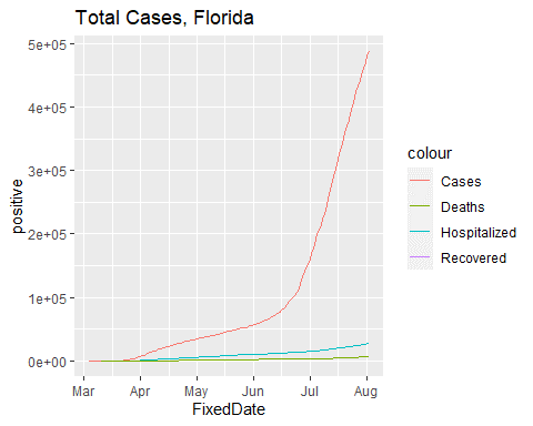
print(totalCases_Central_Plot +
ggtitle("Total Cases, Florida"))
totalCases_Central_Plot = ggplot() +
geom_line(data = dataNewYork,
aes(x = FixedDate, y = positive, color = "Cases")) +
geom_line(data = dataNewYork,
aes(x = FixedDate, y = hospitalizedCumulative, color = "Hospitalized")) +
geom_line(data = dataNewYork,
aes(x = FixedDate, y = recovered, color = "Recovered")) +
geom_line(data = dataNewYork,
aes(x = FixedDate, y = death, color = "Deaths"))
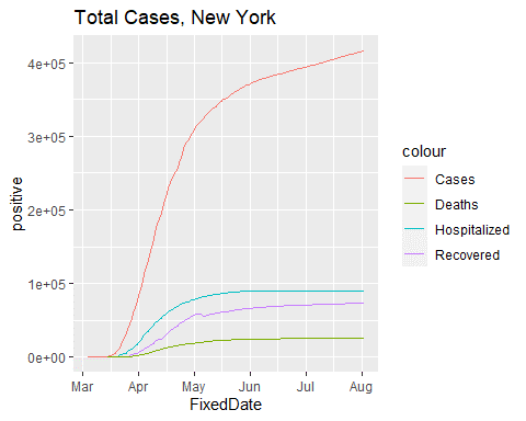
print(totalCases_Central_Plot +
ggtitle("Total Cases, New York"))
totalCases_Central_Plot = ggplot() +
geom_line(data = dataCali,
aes(x = FixedDate, y = positive, color = "Cases")) +
geom_line(data = dataCali,
aes(x = FixedDate, y = hospitalizedCumulative, color = "Hospitalized")) +
geom_line(data = dataCali,
aes(x = FixedDate, y = recovered, color = "Recovered")) +
geom_line(data = dataCali,
aes(x = FixedDate, y = death, color = "Deaths"))
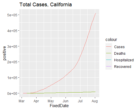
print(totalCases_Central_Plot +
ggtitle("Total Cases, California"))
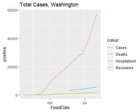
totalCases_Central_Plot = ggplot() +
  geom_line(data = dataWashington,
            aes(x = FixedDate, y = positive, color = "Cases")) +
  geom_line(data = dataWashington,
            aes(x = FixedDate, y = hospitalizedCumulative, color = "Hospitalized")) +
  geom_line(data = dataWashington,
            aes(x = FixedDate, y = recovered, color = "Recovered")) +
  geom_line(data = dataWashington,
            aes(x = FixedDate, y = death, color = "Deaths"))


print(totalCases_Central_Plot +
        ggtitle("Total Cases, Washington"))
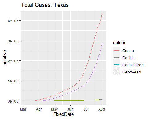
totalCases_Central_Plot = ggplot() +
  geom_line(data = dataTexas,
            aes(x = FixedDate, y = positive, color = "Cases")) +
  geom_line(data = dataTexas,
            aes(x = FixedDate, y = hospitalizedCumulative, color = "Hospitalized")) +
  geom_line(data = dataTexas,
            aes(x = FixedDate, y = recovered, color = "Recovered")) +
  geom_line(data = dataTexas,
            aes(x = FixedDate, y = death, color = "Deaths"))


print(totalCases_Central_Plot +
        ggtitle("Total Cases, Texas"))
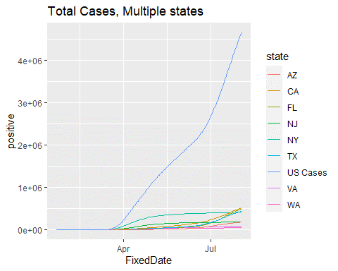
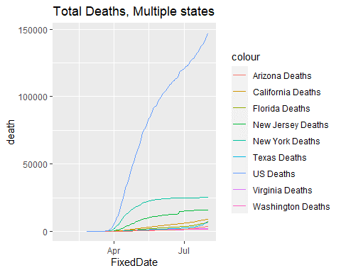
¶ Analysis
The interesting thing about the data below is that while the number of case is climbing steadily, the number of deaths is leveling out. The media presents the rising number of cases in states like Florida and Texas but if you look at the number of deaths over time in states like New York, New Jersey, Massachusetts and Connecticut, they had a huge number of deaths early on and still top the number of deaths in the other states by a wide margin.
totalCases_Central_Plot = ggplot() +
  geom_line(data = dataVirginia,
            aes(x = FixedDate, y = positive, color = state)) +
  geom_line(data = dataNewYork,
            aes(x = FixedDate, y = positive, color = state)) +
  geom_line(data = dataFlorida,
            aes(x = FixedDate, y = positive, color = state)) +
  geom_line(data = dataWashington,
            aes(x = FixedDate, y = positive, color = state)) +
  geom_line(data = dataCali,
            aes(x = FixedDate, y = positive, color = state)) +
  geom_line(data = dataNewJersey,
            aes(x = FixedDate, y = positive, color = state)) +
  geom_line(data = dataTexas,
            aes(x = FixedDate, y = positive, color = state)) +
  geom_line(data = dataArizona,
            aes(x = FixedDate, y = positive, color = state)) +
  geom_line(data = dataUS,
            aes(x = FixedDate, y = positive, color = "US Cases"))


print(totalCases_Central_Plot +
        ggtitle("Total Cases, Multiple states"))
totalCases_Central_Plot = ggplot() +
  geom_line(data = dataVirginia,
            aes(x = FixedDate, y = death, color = "Virginia Deaths")) +
  geom_line(data = dataNewYork,
            aes(x = FixedDate, y = death, color = "New York Deaths")) +
  geom_line(data = dataFlorida,
            aes(x = FixedDate, y = death, color = "Florida Deaths")) +
  geom_line(data = dataWashington,
            aes(x = FixedDate, y = death, color = "Washington Deaths")) +
  geom_line(data = dataCali,
            aes(x = FixedDate, y = death, color = "California Deaths")) +
  geom_line(data = dataNewJersey,
            aes(x = FixedDate, y = death, color = "New Jersey Deaths")) +
  geom_line(data = dataTexas,
            aes(x = FixedDate, y = death, color = "Texas Deaths")) +
  geom_line(data = dataArizona,
            aes(x = FixedDate, y = death, color = "Arizona Deaths")) +
  geom_line(data = dataUS,
            aes(x = FixedDate, y = death, color = "US Deaths"))


print(totalCases_Central_Plot +
        ggtitle("Total Deaths, Multiple states"))
Percentage Immunity over Time
totalCases_Central_Plot = ggplot() +
  geom_line(data = dataVirginia,
            aes(x = FixedDate, y = percentImmunity, color = "Percentage Immune"))

print(totalCases_Central_Plot +
        ggtitle("Herd Immunity, Virginia"))
totalCases_Central_Plot = ggplot() +
  geom_line(data = dataNewYork,
            aes(x = FixedDate, y = percentImmunity, color = "Percentage Immune"))

print(totalCases_Central_Plot +
        ggtitle("Herd Immunity, New York"))